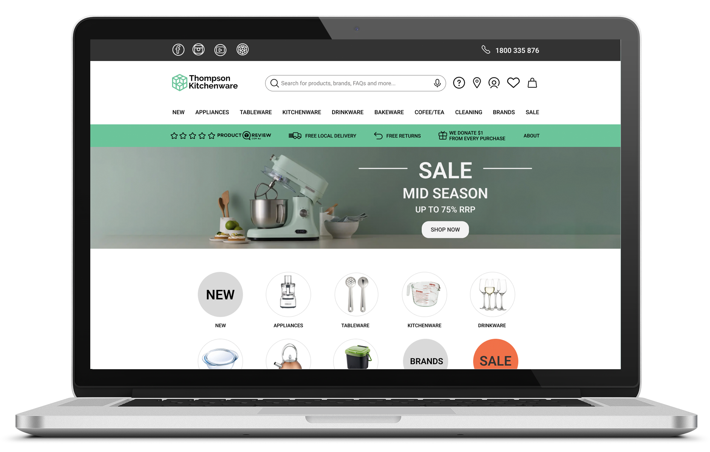
Thompson Kitchenware
Merged user needs and business objectives to achieve brand adoption through the online presence, leading to the on-target revenue increase.

TEAM
SOLO project, time frame FOUR weeks
End-to-end UX Process
Market Research ⎮ User Interviews ⎮ Affinity Mapping ⎮ Defining User Archetype ⎮ User Journey ⎮ Competitive/ Comparative Analysis ⎮ User Flows ⎮ Card Sorting ⎮ Information Architecture ⎮ Sketching ⎮ Wireframing ⎮ UX Prototyping (mid-fidelity) ⎮ Usability Testing
TOOLS
CHALLENGE
Thompson Kitchenware is a local retail store with well-priced curated products and exceptional customer service. They want to expand their business online but wish to maintain the same brand feel and company values.
TASK
My objective was to create a desktop website to help the well-established family business expand from only brick-and-mortar to an online store and create an online shopping experience in line with customer needs and business objectives.
SOLUTION
I designed a digital platform that gave TK a digital presence aligned with established branding. By providing a seamless, data-informed shopping experience, my solution can lead to customer acquisition, redemption, and on-target revenue increase.
01 EMPATHISE
Following UX Design methods, it was essential to reflect business and customer ideals in the final solution.
I began my project by conducting market research to gain insights into business challenges when selling their products online. After completing the research, I better understood the issues that need to be addressed when designing a new e-commerce digital platform. Additionally, I obtained valuable information on the demographics of kitchenware buyers and identified the people I needed to recruit for my qualitative research.

But what about User needs and ideals?
I conducted User Interviews to find out:
Who is the average user?
Why and how do they shop for kitchenware products?
What are their needs, motivations and frustrations?
02 DEFINE
Affinity Map helped identify the main trends regarding their online shopping needs, pain points and frustrations.
I was already aware of Thompson Kitchenware's business ideals, which should be reflected in the final solution, as per the project brief.
Offer curated products with an emphasis on quality over quantity
Great customer service
Supporting local community by offering reasonably priced products and free local delivery
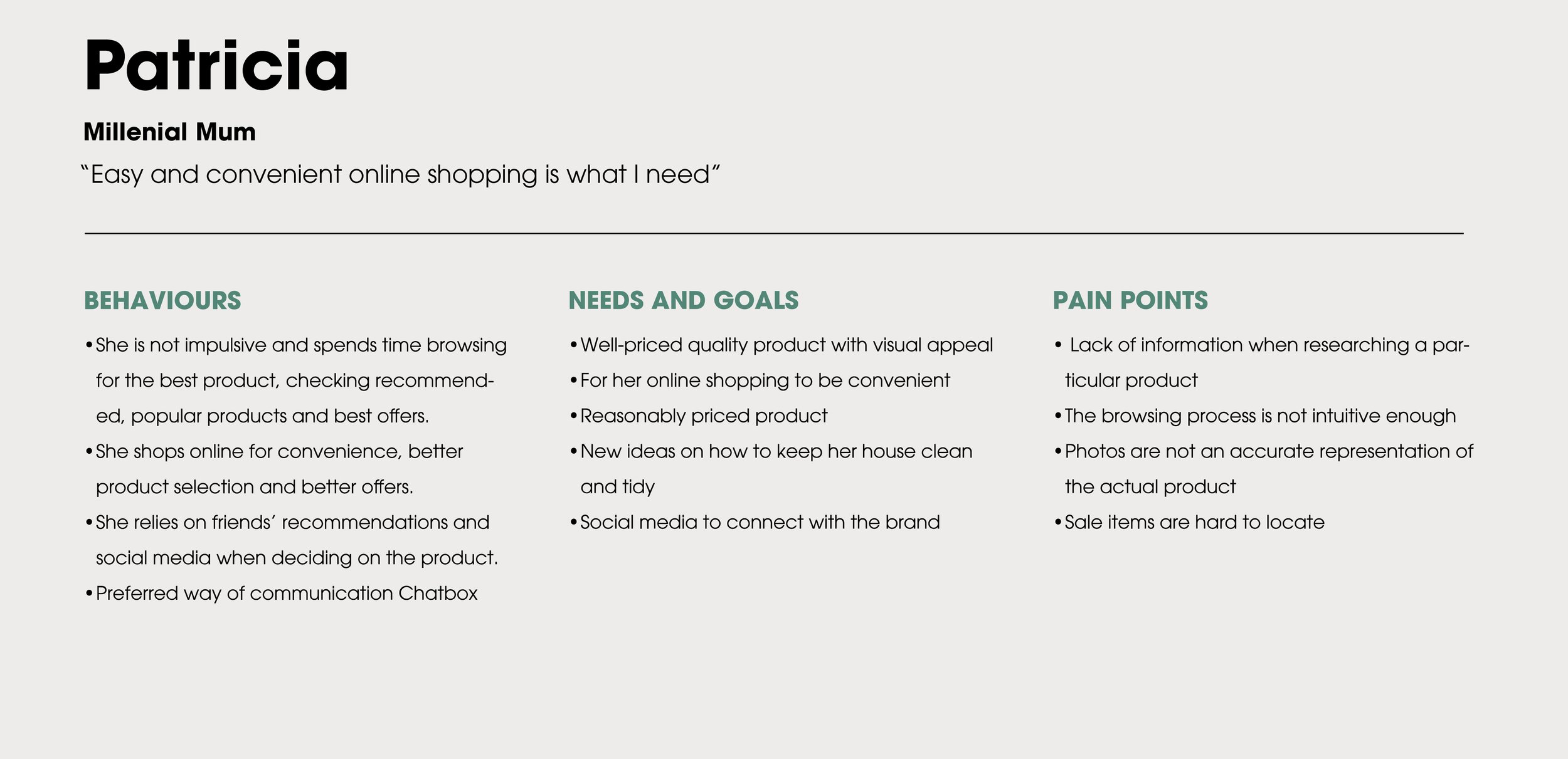
I summarised all my findings about kitchenware customers to identify two main user archetypes.

To empathise with people even more and visualise the whole shopping process, I drafted a User Journey to identify their pain points and highlight opportunities for improvement.
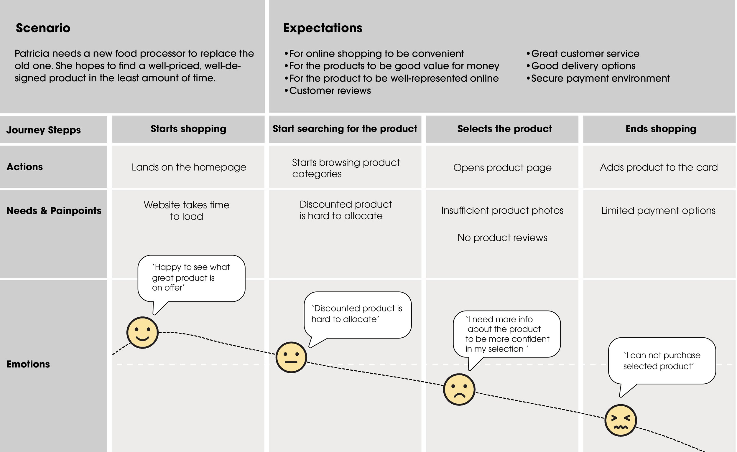
User Journey highlighted what customers needed the most & opportunities to drive solutions:
01 Add more details to the product page to showcase the product accurately
02 Reduce the time to log in and time to select the product
03 Provide different payment methods.
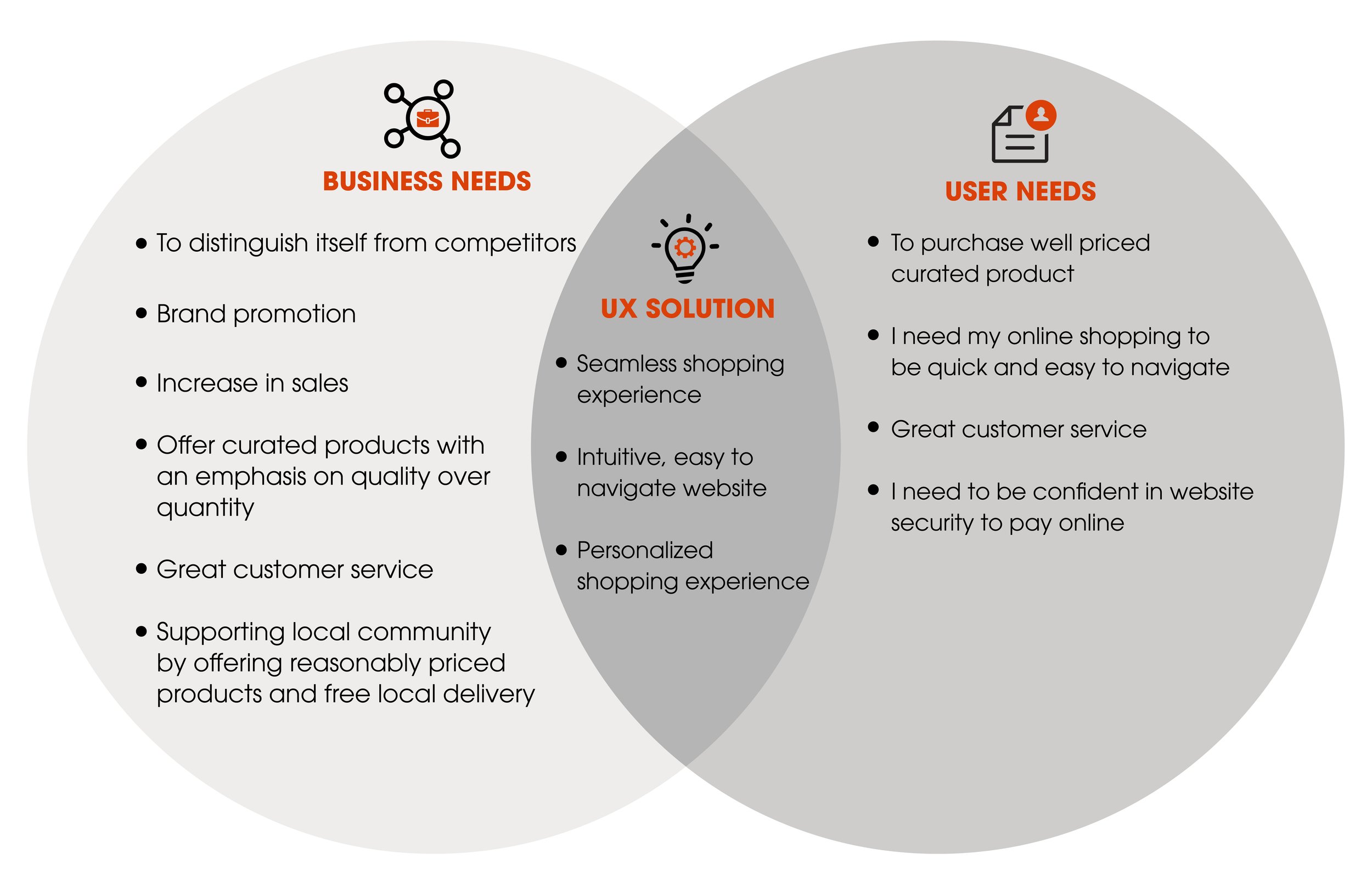
Project goals
Leveraging customer needs and business objectives to create user-centred, intuitive experiences to create meaningful relationships between the Thompson Kitchenware brand and people.
03 DEFINE
Synthesizing the insights and needs from the Affinity Map, I understood better understood what are the most important customer problems I needed to solve.
NEEDS
People need true-to-life product representation online.
People need for their product research to be quick and easy.
People need to be confident in website security before using their credit card details online.
PROBLEM STATEMENTS
Patricia needs a good product description page so that she can finalize her shopping bag with condidence and go back to her busy lifestyle.
Patrician needs product selection to be fast and easy, so that she can complete her shopping quickly and go back to her busy lifestyle.
Ann needs a secure shopping environment because she wants to be able to use her credit card with confidence to finalise payment online.

HMW
How might we achieve a good product description?
How might we make product selection quicker?
How might we create a secure shopping environment?
Based on the persona and user findings, I defined what should be the main focus of my project.
PROBLEM STATEMENT
‘Patricia needs a good product description to finalise her shopping confidently and return to her busy lifestyle.’
HOW MIGHT WE achieve a good product description?
HYPOTHESIS: We believe that by adding high-quality product photos, live images, videos and augmented reality to the product details page, we will breach the gap between in-store and online shopping and create a realistic representation of product design and functionality so that the customer has all information needed to purchase the product online
We will know this to be true when we see positive feedback after usability testing.
Why was Competitive/Comparative Analysis beneficial for the project?
The next step was to research what other similar businesses offer and what TK is competing against.
What other websites look like that sell similar products?
2. What is TK competing against?
3. How can we differentiate ourselves in the same market and offer a shopping experience with the difference?
What are the e-commerce trends for 2023?
I also looked into current e-commerce trends, further analysing features that could align with business and user needs in creating an online shopping experience that will bring value to both.
AR enhances the reality of online shopping.
There will be a growing volume of voice searches.
Customers respond to videos.
Chatbots improve the shopping experience.
More ways to pay.
Subscriptions keep customers coming back.
Current User Flow
Before proceeding to the next stage of wireframes ideation, I created User flows that allowed me to focus on what screens are needed to enable the user to reach their goal of buying a product online.
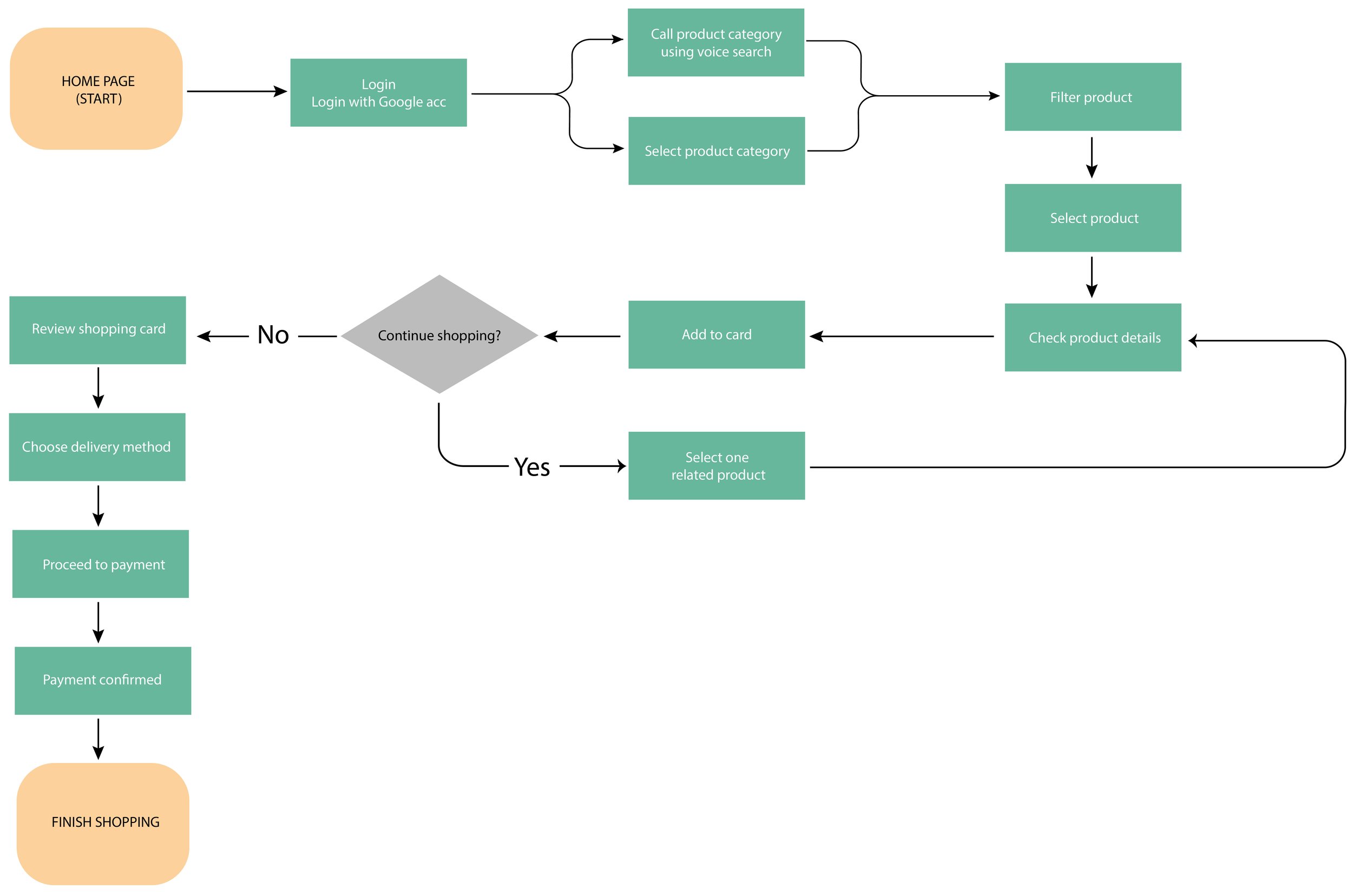
Conducting Closed Card Sorting with 4 people helped me define information architecture and make an easy-to-use website.
It would enable people to navigate through the website as intuitively as possible. This exercise revealed that A COFFEE/TEA CATEGORY SHOULD BE CREATED for all coffee or tea-making products. Also, the previous Home & Living has been amended to the ‘CLEANING’ category, and Partywear was moved to ‘TABLEWARE’
With all the categories created, I placed them into Site Map to make the main product categories of my sitemap and define website information architecture.

04 IDEATE
From sketches to the first clickable prototype
My initial sketches focused on quickly visualising different user flows to create wireframes to help users finish purchasing products online. I then used my sketches to develop mid-fi wireframes linked into a clickable prototype. I proposed a UX solution for the new eCommerce website to bridge user needs and business objectives.
05 TEST
To validate my solution, I conducted Usability Testing. The user was given the task:
“You are looking to purchase a particular product, Food Processor Kenwood FP220; how would you use this website to buy this item?
The goal was to determine how easy it was to perform the task.
I needed to find out if the product page had sufficient details so that customers understood the design and functionality of the product and were confident in their ability to proceed with the payment.
Metrics used - Intuitiveness (Qualitative)
How easy was it to complete the task on a scale of 1–10?
Why did you give this particular rating?
Do you think videos and AR help are beneficial in understanding the design and functionality of the product?
Heat Map Findings
The product and Category Page needs correcting.
The checkout process was too complex and confusing.
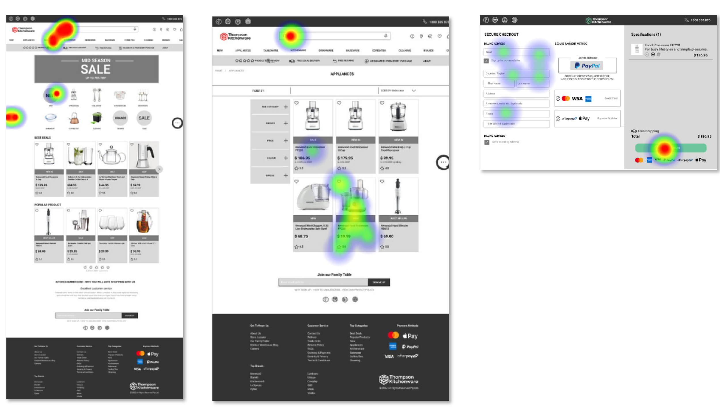
Next step
List the correct product description on the Category Page
The checking out process needs to be simplified
Solution


Final Prototype
I incorporated my findings from two rounds of usability testing, which improved website usability to 80%, and there were no screens to rework.
Recommendations
To validate my solutions, further testing will be needed.
Reflections
For this project, I interviewed a limited number of people. Next time, I would aim to conduct at least 5–6 users per persona to avoid cognitive biases.
It would be beneficial to ideate/brainstorm/explore more to push my ideas and creative thinking by reframing my problem statement to be less specific and potentially using how might we’s/Crazy 8's.
For my next project, I will start usability testing as early as low-fidelity prototyping.
Thank you for your time, and stay tuned. New projects are coming! 🙂…
